

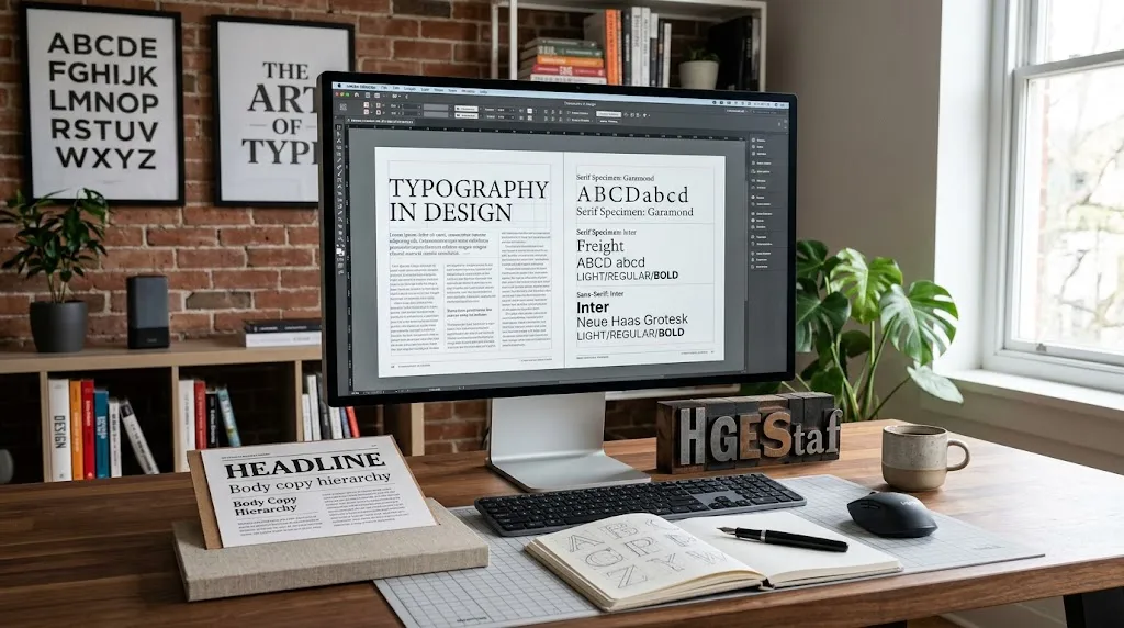
Typography is one of the most influential elements in visual design. A font can make a brand feel modern, trustworthy, playful, luxurious, technical, or approachable before a reader has processed the first sentence. That makes typography much more than a decorative choice—it is a communication tool that shapes readability, hierarchy, user experience, and brand perception.
Whether you are designing a website, logo, advertisement, presentation, packaging, social media graphic, or editorial layout, the right typography helps people understand information quickly and connect with the visual identity behind it. The wrong choice can make even excellent content feel confusing, outdated, or difficult to read.
In this guide, we explore the essentials of typography, how fonts influence design, the major typeface categories, font pairing, hierarchy, spacing, readability, accessibility, and practical ways to build a stronger typographic system.
What Is Typography?
Typography is the art and practice of selecting, arranging, and styling text so that written information is clear, functional, and visually appropriate. It includes decisions about typefaces, font sizes, weights, spacing, alignment, line length, hierarchy, and overall text composition.
It is useful to distinguish between a typeface and a font. A typeface describes the broader design system of letterforms, while a font traditionally refers to a specific style, weight, or variation within that typeface. In modern digital design, the terms are often used interchangeably.
Typography therefore sits at the intersection of communication and visual design. It determines not only what words say, but also how those words feel and how easily people can process them.
Why Typography Matters in Design
Typography can influence how users perceive information before they consciously analyze the design. Research and design guidance from organizations such as Microsoft, Adobe, Figma, and Google consistently emphasize the role of typography in communication, hierarchy, usability, and brand expression.
Good typography can help a design accomplish several important goals:
- Make information easier to read and scan.
- Create a clear visual hierarchy.
- Communicate personality and tone.
- Strengthen brand recognition.
- Guide users toward important information or actions.
- Create consistency across digital and printed materials.
- Improve the overall visual balance of a layout.
Typography is particularly important in digital products because users often skim content rather than reading every word. Strong hierarchy, appropriate sizing, and effective spacing allow readers to locate what matters without unnecessary effort.
How Fonts Influence Brand Perception
Fonts have personalities. A heavy geometric sans serif may communicate confidence and modernity, while a traditional serif can suggest heritage, authority, or editorial sophistication. A handwritten script may feel personal, creative, or informal.
These associations are not universal rules, but they demonstrate why type selection should support the message behind a design.
For example, a financial institution may benefit from a restrained and highly legible typographic system that communicates stability. A children’s brand might use softer, more expressive lettering. A luxury publication may combine refined serif typography with generous spacing and restrained supporting elements.
Consistency is equally important. When the same typographic choices appear across a website, packaging, advertising, social media, and other brand touchpoints, audiences can develop stronger visual recognition.
The Main Types of Typefaces
Understanding broad typeface categories makes font selection easier. Each category has different visual characteristics and common applications.
Serif Fonts
Serif typefaces contain small finishing strokes at the ends of letterforms. They are strongly associated with traditional publishing, editorial design, books, and established brands, although contemporary serif fonts are also widely used in digital interfaces.
Serifs can provide a distinctive visual personality and can work effectively for headings, editorial layouts, and body copy when the chosen typeface is appropriately designed and sized.
Sans Serif Fonts
Sans serif typefaces do not have the small finishing strokes found in serif designs. They are common in websites, applications, presentations, signage, and modern brand identities because of their clean appearance.
Sans serif does not automatically mean better readability. The specific typeface, size, spacing, contrast, and surrounding layout all contribute to how easy text is to read.
Script Fonts
Script typefaces imitate handwriting or calligraphic forms. They can add personality and elegance to invitations, logos, short headlines, packaging, and decorative applications.
Because highly expressive scripts can become difficult to read at smaller sizes, they are usually more effective when used selectively rather than for long paragraphs.
Display Fonts
Display typefaces are designed to attract attention. They can be bold, unusual, condensed, decorative, experimental, or highly expressive.
They work particularly well for headlines, posters, campaign graphics, logos, and other short pieces of text where visual impact is more important than extended reading comfort.
Monospace Fonts
Monospace typefaces assign characters a consistent width. They are strongly associated with coding, technical interfaces, terminals, and typewriter-inspired visual styles.
Their distinctive spacing can also be useful as a deliberate contrast element in editorial or branding work, although they are not the default choice for most long-form body text.
Typography and Visual Hierarchy
Visual hierarchy tells readers what to look at first, second, and third. Typography is one of the primary tools designers use to establish that hierarchy.
A well-structured typographic system might include:
- A prominent headline.
- A supporting introduction or subheading.
- Clearly differentiated section headings.
- Readable body text.
- Smaller supporting information.
- Distinct treatments for links, buttons, labels, or calls to action.
Hierarchy does not require a large collection of fonts. Designers can create meaningful differences through size, weight, spacing, alignment, capitalization, and style while keeping the overall system cohesive.
Font Size, Weight, and Scale
Font size determines how prominently text appears and directly affects readability. Body copy that is too small can create unnecessary friction, while excessively large text can make a layout feel unbalanced.
Font weight provides another level of hierarchy. A bold or semibold heading can stand apart from regular body copy without requiring a completely different typeface.
A consistent type scale can make a design easier to maintain. Instead of selecting every text size independently, designers can establish a small set of sizes for headings, subheadings, body text, captions, and interface elements.
Letter Spacing and Kerning
Spacing between letters can dramatically change the appearance of typography.
Kerning
Kerning adjusts the space between specific pairs of characters. It is especially important in large headlines, logos, and display typography because awkward gaps can become highly visible.
Tracking
Tracking changes the overall spacing across a group of letters. Increasing tracking can make uppercase labels feel more open and refined, while excessive tracking can weaken word recognition.
Good spacing should support the intended reading experience rather than simply making text look more spacious.
Line Height and Readability
Line height, sometimes called leading, controls the vertical space between lines of text. It has a major effect on how comfortable a paragraph feels.
If lines are packed too tightly, readers can lose their place when moving from one line to the next. If the spacing is excessive, individual lines may feel disconnected.
The ideal setting depends on the typeface, font size, line length, content, and medium. Web layouts often benefit from more generous line spacing than compact display designs.
Line Length and Text Density
Typography is not only about the letters themselves. The width of the text block also affects readability.
Very long lines can make it harder for readers to track from the end of one line back to the beginning of the next. Extremely narrow columns can create excessive line breaks and interrupt reading rhythm.
For websites and editorial layouts, designers should consider the relationship between font size, line height, column width, and surrounding whitespace instead of optimizing any single variable in isolation.
How to Pair Fonts Effectively
Font pairing involves selecting typefaces that work together while creating enough contrast to establish clear roles.
A common approach is to pair a serif with a sans serif. One typeface may handle headlines while the other supports body copy. Another approach is to use a single versatile type family with multiple weights and styles.
When evaluating a font combination, ask:
- Do the typefaces have clearly defined roles?
- Is there enough contrast between headings and body copy?
- Do the letterforms feel visually compatible?
- Does the combination remain readable at smaller sizes?
- Does the pairing support the brand personality?
- Does it work consistently across different screens and formats?
More fonts do not automatically produce a more sophisticated design. In many projects, a restrained system using one or two carefully selected families is easier to manage and more cohesive.
Typography in Web and UI/UX Design
On websites and digital products, typography directly affects how people scan navigation, understand content, identify controls, and complete tasks. This makes typography an important part of user experience rather than a final decorative layer.
Typography should work alongside layout, color, spacing, buttons, icons, and other interface elements. A well-designed interface uses text consistently so users can quickly recognize headings, labels, instructions, links, and actions.
For a broader look at creating intuitive digital experiences, see creating user-friendly UI/UX designs.
Typography and Accessibility
Accessible typography aims to make information usable by as many people as possible. Designers should consider more than simply choosing a visually attractive font.
Important considerations include:
- Readable font sizes.
- Sufficient contrast between text and its background.
- Clear distinction between interactive and non-interactive text.
- Comfortable line spacing.
- Reasonable line lengths.
- Responsive behavior across screen sizes.
- Text that remains understandable without relying entirely on visual styling.
Accessibility should be considered from the beginning of the design process rather than added after the visual system is complete.
Typography and Creativity
Typography gives designers another way to express ideas. The choice of typeface, scale, spacing, alignment, and composition can transform ordinary words into a visual statement.
Creative typography can be especially effective in posters, campaigns, editorial layouts, packaging, social media graphics, and experimental digital experiences. However, creativity works best when it remains connected to communication.
Designers interested in the broader relationship between creativity and visual problem-solving can also explore the role of creativity in problem-solving and unlocking your inner artist.
Typography, Art, and Visual Composition
Typography can also be treated as a visual shape. Large letters can create rhythm, contrast, movement, and balance just like other graphic elements.
This approach becomes particularly relevant when typography is combined with illustration, photography, abstract forms, or other artistic techniques. Designers can experiment with scale, cropping, alignment, repetition, and negative space while still maintaining a readable message.
For related creative inspiration, explore abstract art techniques and ideas and nature photography tips for stunning shots.
Common Typography Mistakes to Avoid
Using Too Many Fonts
Mixing too many typefaces can make a design feel chaotic. Establish a small typographic system and give each style a clear purpose.
Ignoring Readability
A visually impressive font is not useful if readers struggle to understand the content. Always test typography in the actual layout where it will appear.
Creating Weak Contrast
Headings and body copy should have enough visual distinction to establish hierarchy. Contrast can come from size, weight, spacing, style, or typeface choice.
Using Decorative Fonts for Long Copy
Highly decorative typefaces are generally better suited to short text. Extended paragraphs require a font that supports comfortable reading.
Ignoring Mobile Screens
A type treatment that looks excellent on a desktop monitor may become cramped or oversized on a phone. Responsive typography should be tested at multiple screen widths.
Choosing a Font Without Testing It
A font can look attractive in a font menu but behave differently in an actual design. Test real headlines, paragraphs, numbers, buttons, and other content before committing to a typographic system.
How to Choose the Right Font for a Design Project
Instead of starting with the question, “Which font looks best?” start with the project’s communication requirements.
- Define the audience. Consider who will read or interact with the design.
- Define the tone. Decide whether the project should feel formal, friendly, modern, traditional, technical, playful, or premium.
- Identify the medium. A website, printed brochure, logo, app, and billboard have different typographic requirements.
- Prioritize readability. Test actual content rather than relying only on sample words.
- Build hierarchy. Determine which text deserves the strongest visual emphasis.
- Limit unnecessary complexity. Use only as many typefaces and variations as the design actually needs.
- Test across devices. Check the design on desktop, tablet, and mobile screens when relevant.
Typography for Branding
Brand typography should be consistent enough to become recognizable while flexible enough to work across different applications.
A brand may use one primary typeface for most communications and a secondary typeface for contrast. Some brands can achieve an entire visual identity using a single type family with carefully selected weights and styles.
The most effective choice is not necessarily the most unusual font. It is the one that communicates the desired personality while remaining functional across the brand’s real-world touchpoints.
Typography in Modern Digital Design
Modern design systems increasingly treat typography as a structured system rather than a collection of individual font choices. Designers may define type scales, semantic roles, responsive sizes, weights, spacing rules, and accessibility requirements in advance.
Variable fonts have also expanded the possibilities for responsive typography by allowing multiple design dimensions, such as weight or width, to be adjusted within a single font file. This can give digital products more control over typography while supporting flexible layouts.
Google’s guidance on choosing web fonts similarly emphasizes project requirements, available weights and styles, language support, and the technical characteristics of a type family.
Practical Typography Checklist
- Choose typography based on the project’s purpose.
- Make readability a priority.
- Establish a clear heading and body-text hierarchy.
- Use font weight intentionally.
- Adjust line height for comfortable reading.
- Pay attention to letter spacing and kerning.
- Keep line lengths manageable.
- Use a limited number of typefaces.
- Check contrast and accessibility.
- Test typography on real devices and realistic content.
- Keep typography consistent across brand touchpoints.
Final Thoughts
Typography is one of the foundations of effective design because it connects written communication with visual expression. The right typeface can establish personality, create hierarchy, strengthen a brand, and make information easier to understand.
The strongest typography choices are rarely about choosing the most fashionable font. They are about selecting type that fits the audience, message, medium, and visual system. When font selection is combined with thoughtful spacing, hierarchy, contrast, and accessibility, typography becomes an active part of the design rather than a decorative afterthought.
Whether you are building a website, developing a brand identity, creating editorial artwork, or improving a digital interface, understanding typography gives you greater control over how people see, read, and experience your design.
Frequently Asked Questions About Typography
Why is typography important in design?
Typography helps communicate information, establish visual hierarchy, influence perception, improve readability, and express brand personality. It can affect how users understand and respond to a design.
What is the difference between a font and a typeface?
A typeface refers to a broader family or design of letterforms, while a font traditionally identifies a particular style or variation within that family. In modern digital usage, the terms are frequently used interchangeably.
How many fonts should a design use?
There is no universal number, but many projects can remain cohesive with one or two type families. Additional styles should have a clear purpose rather than being added simply for variety.
Which is better for web design, serif or sans serif?
Neither category is automatically better. The specific typeface, size, spacing, contrast, content, and layout determine readability. Both serif and sans serif fonts can work effectively on the web.
How does typography affect branding?
Typography contributes to brand personality and consistency. Repeated use of carefully selected typefaces across websites, packaging, advertising, and other communications can strengthen visual recognition.
What makes a font readable?
Readability depends on several factors, including letterform design, font size, spacing, line height, line length, contrast, and the surrounding layout. The best choice should be tested using the actual content and medium.